Rhombus
|
class gui.Checkbox(): | implements WindowChildView | constructor ( | label :: ObsOrValue.of(View.LabelString), | ~checked: checked :: ObsOrValue.of(Boolean) = #false, | ~action: action :: Boolean -> ~any = values, | ~style: style :: List.of(Checkbox.Style) = [], | ~margin: margin :: ObsOrValue.of(View.Margin) = [2, 2], | ~min_size: min_size :: ObsOrValue.of(View.Size) = [#false, #false], | ~stretch: stretch :: ObsOrValue.of(View.Stretch) = [#false, #false], | ~enable: enable :: ObsOrValue.of(Boolean) = #true, | ~window_callbacks: window_callbacks :: maybe(WindowCallbacks) = #false | ) |
|
|
|
|
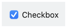
Creates a checkbox. See
View.LabelString for
information about keyboard mnemonics in
label.
The function call action(now_checked) is
performed when the checkbox is clicked by a user, where
now_checked indicates the newly toggled state of the
checkbox.
The Checkbox.at_checked property returns an observable that
is updated whenever the checkbox’s state changes through an action (as
also reported via action) or via checked as an
observable.
See Geometry Management for information about ~margin,
~min_size, and ~stretch.
The ~window_callbacks argument configures
callbacks that are common to all WindowChildViews.
See WindowCallbacks for more information.
A checkbox style option. No options are supported, currently.