class | |||||||||||||||||||||||
| |||||||||||||||||||||||
| |||||||||||||||||||||||
property | |||||||||||||||||||||||
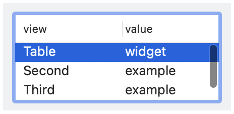
The function call action(event, choices, selection) is performed when the table seelct is changed by the user, where event indicates the kind of action, choices indicates the choices at the time of the event, and choice selection identifies the selected rows.
The Table.at_selection property returns an observable that is updated whenever the table’s selection state changes through an action (as also reported via action) or via selection as an observable.
The choice_to_row function converts an element of choices to an array of label strings to show in the table.
The style list must contain exactly one of single, #'multiple, and #'extended.
See View.LabelString for information about keyboard mnemonics in label.
See Geometry Management for information about ~margin, ~min_size, and ~stretch.
The ~column_widths argument controls the widths of the columns. Column width can be specified either as a list of the column index (starting from 0) and the default width or a list of the column index, the column width, the minimum width, and the maximum width. If the ~column_widths lacks an entry for a column in the table, a width is determined automatically.
The ~window_callbacks argument configures callbacks that are common to all WindowChildViews. See WindowCallbacks for more information.
#'single: Creates a table where at most one row can be selected at a time. On some platforms, the user can deselect the (sole) selected item. The #'single, #'multiple, and #'extended styles are mutually exclusive, and one of them must be present.
#'multiple: Creates a multiple-selection table where a single click deselects other rows and selects a new row. Use this style for a table when single-selection is common, but multiple selections are allowed.
#'extended: Creates a multiple-selection table where a single click extends or contracts the selection by toggling the clicked row. Use this style for a table when multiple selections are the rule rather than the exception.
The #'multiple and #'extended styles determine a platform-independent interpretation of unmodified mouse clicks, but dragging, shift-clicking, control-clicking, etc. have platform-standard interpretations. Whatever the platform-specific interface, the user can always select disjoint sets of rows or deselect rows (and leave no items selected).
#'column_headers: Shows the table column names.
#'clickable_headers: Allows the user to click a table column, where clicks are handled by the table’s ~action callback. For historical reasons, #'clickable_headers has no effect on Windows, and header clicks are always reported.
#'reorderable_headers: Allows the user to reorder table columns, where the table’s ~action callback receives a notification of reordering.
#'variable_columns: Allows new columns to be added dynamically.
#'horizontal_label: When the table has a label, show it to the left of the control. Horizontal label placement is the default if #'vertical_label is not specified, and #'horizontal_label and #'vertical_label are mutually exclusive.
#'vertical_label: When the table has a label, show it above the control.
enumeration | ||||
|
annotation | |
|
annotation | |
|
[Int, View.SizeInt] || [Int, View.SizeInt, View.SizeInt, View.SizeInt]
for specifying the width of the column indicated by the leading Int in the list (counting from 0).
